It’s 2025, which means my team turns 100 next year.
In the past year or so, new ownership has meant the club as a whole has (finally) been moved towards the 21st century in terms of its structure behind the scenes, and it’s hopefully going to (finally) have a redeveloped stadium in the near future.
However, there’s a long way to go in order for Castleford Tigers to be seen as a truly professional organisation in the eyes of the more general public, and I see the 100-year anniversary of the club’s founding as a perfect time to do this.
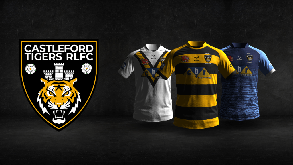
You’ve already seen my end product at the top of this page, but the rest of this blog post(?) will be explaining the process of how I got there.
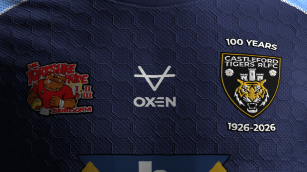
Before I say anything else, a huge thanks to the Castleford Tigers Heritage Project (link here) for making my life much easier while doing all of this with their fantastic work.
Step one: the colours
Rugby league fans will be well-aware that we’ve had somewhat of a crisis of indecision in Castleford since the turn of the millennium.
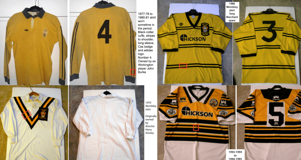
Our current badge (since 1998) is orange. Tigers are orange. A lot of our recent branding, merchandise and kits have been orange.
However, we didn’t have an orange home shirt until 2001 – 75 years into the club’s history – and before that, the club was decidedly amber.
I’m ignoring the spell between 2015 and 2024 where we didn’t have a single predominantly-amber shirt, and going with amber as the Castleford Tigers colour now, and going forward. Amber is back, and hopefully, it’s here to stay.
This is a huge part of any club’s identity. FC Barcelona are the blaugrana (Catalan for blue and dark-reds), Liverpool FC are the Reds, Tottenham Hotspur are the Lilywhites, Wigan Warriors are the Cherry and Whites. Borussia Dortmund have the ‘Yellow Wall’. It’s ridiculous, really, that we haven’t got a definitive answer to the question, “what colours do Castleford Tigers wear?”.
My suggestion: black and amber, forever.
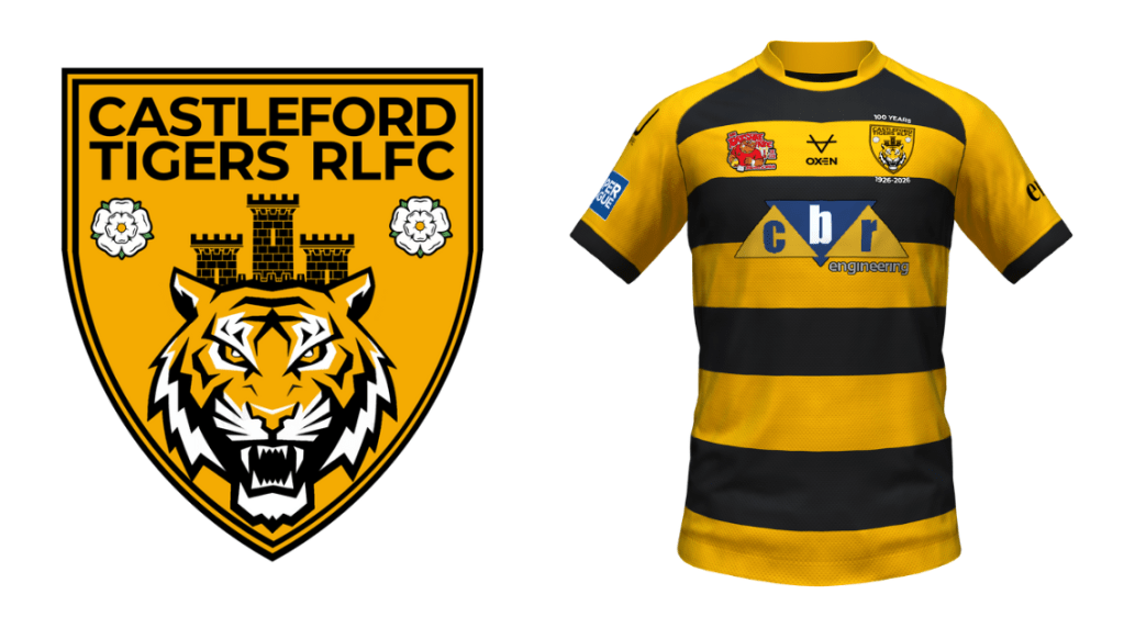
Step two: the badge
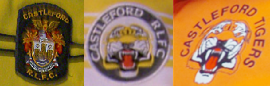
Across the club’s history, we’ve had, really, three main badges. Until rugby league in this country decided we all needed to add animals into our clubs’ names, it was always some variation of the town’s coat of arms, and for a period, the club’s name ‘Castleford RLFC’ was added to this.
However, a Tiger became the focus in 1991, half a decade before the birth of ‘Super League’, and we had a circular crest wayyyy before it was cool. Manchester City, Wigan Warriors, Paris Saint-Germain – eat your hearts out!
First, it had ‘Castleford RLFC’ on still, and then this changed to ‘Castleford Tigers’ in 1998. Other than that, the design was pretty much the same.
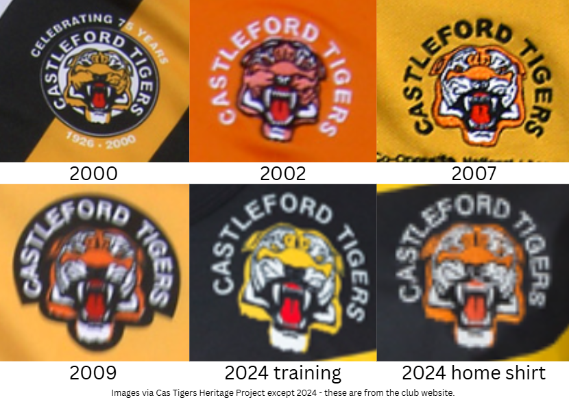
Since then, it’s been a bit blurry. Does the badge have a black circle? Does it have an… outline-y thing?. Is the tiger orange or amber?
This is another indicator that we seriously need a rebrand.
The shape of the badge
First off, I tried a circular badge. It’s the most similar to what we’ve currently got, and is what we had in the 1990s.
However, I just didn’t like the designs I came up with. The shape, I felt, didn’t massively lend itself to my ideas, and a complete move away from the designs of the past 30 years felt like a better idea.
How else can the shape of the badge lend itself to the club’s history then?
I briefly considered trying to incorporate the distinctive octagonal shape of Castleford Pottery’s teapots, but this felt too niche, and it would have been incredibly abnormal in the sporting world. A fun idea, but not the way I wanted to ultimately go.
Instead, I looked back to the first, and longest-serving, badge. The coat of arms.
There’s a shield in the middle of it, and a shield is the current design of choice, it seems, in the sport. The NRL logo, the St Helens badge, the Wakefield Trinity badge, the Hull teams’ badges… the list goes on. Which is a shame, as I would have liked the shape to stand out from the crowd a bit more, but there are only so many shapes you can have a rugby league team’s badge without it looking really weird.
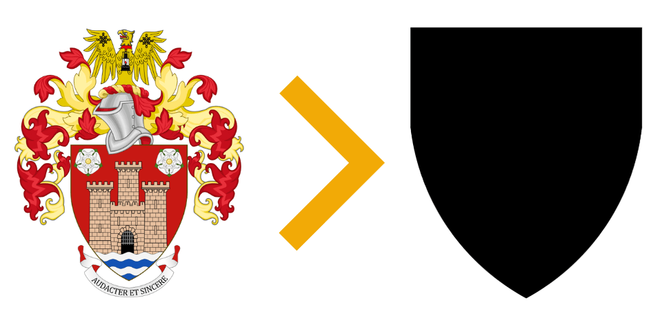
I took the exact shape of the shield in the town’s coat of arms, and from there, I worked.
The tiger
Our current badge is a remnant of a time where skeuomorphism ruled the roost in design. This was where graphic design attempted to look a lot like the real-world things that it was looking to convey. This continued until, I would say, the early 2010s, and since then, flat design is the go-to.
Nothing illustrates this change better than the jump from Apple’s iOS 6 to iOS 7 in 2013.
That’s why the tiger in the logo is so detailed. It’s why there are no straight edges. It looks a lot like a tiger actually would look if it was staring you in the face.
Nowadays, that’s not how design goes, and as a result, the tiger in my design is flatter. More of an icon representation of a tiger than actually trying to look like a tiger.
The design
Okay, enough talk about graphic design trends. Let’s get into it.
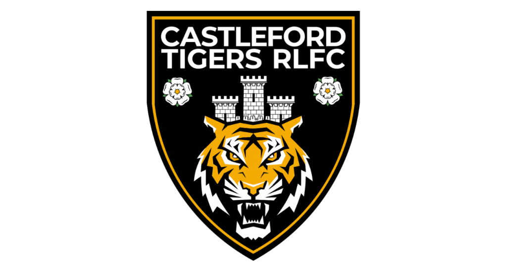
First of all, I added a border around the shield. I wanted it to evoke the iconic black-amber-black design that has found its way into so many shirts across the years.
In the end, it doesn’t reeeeally. For it to do so, the badge would have had to be mostly amber, and then, it just doesn’t stand out on an amber shirt. And I didn’t really like it regardless. But if you try really hard to imagine it, it’s still there on the border I went for. Kind of.
Once I had decided on this, I looked back to the coat of arms. Our current design could be for a team in any village, town or city in the world. There’s nothing Castleford there. It’s just a tiger.
First of all, what represents Castleford better than the castle from the coat of arms? I know there isn’t actually a castle in the town, but it’s a nod to the settlement’s Roman origins, being built on the site of Roman army fort Lagentium.
I didn’t think the Xscape or Tickle Cock Bridge were quite as suitable to represent the town. And there’s a castle in Pontefract anyway. And it makes it even easier for people from the right end of the country to tell Southerners and Australians alike that it’s ‘Castleford’, not ‘Carstleford’.
To add to the tiger and the castle, I wanted to be able to add something that represents the first thing that anyone from Castleford will tell you when you meet them: Castleford is in Yorkshire. And the coat of arms includes the Yorkshire rose twice, and I really liked the positioning of the roses in it too. They sit either side of the castle really nicely. So I completely stole it. But I think this works – again, I really wanted this badge to represent Castleford as a place as well as the club.
That left me with this.
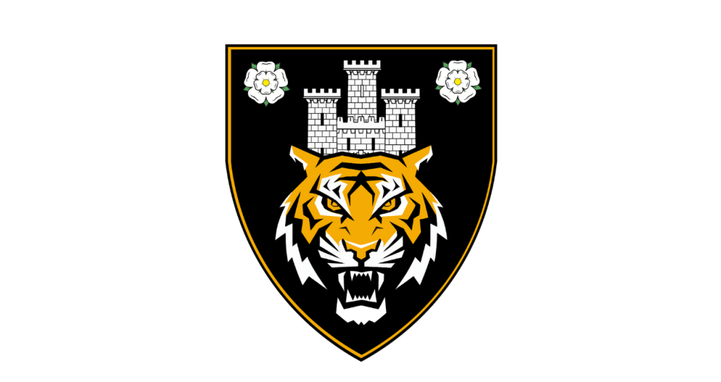
I was really happy with this, and I still am, but there’s a glaring omission. The name of the club.
That left me with a dilemma. Are we ‘Castleford Tigers RLFC’ or ‘Castleford Tigers’?
I wanted to keep RLFC, as a nod to the many years of it being on our badge.
Now, what do I emphasise? Are we ‘Castleford Tigers RLFC’ or ‘Castleford Tigers RLFC’? This was trickier to decide, but I ended up putting ‘Castleford’ on a line on its own. You can tell we’re Tigers anyway.
Adjusting the spacing between the letters slightly made the two lines ‘line up’ perfectly, and there, I was left with a couple of options.
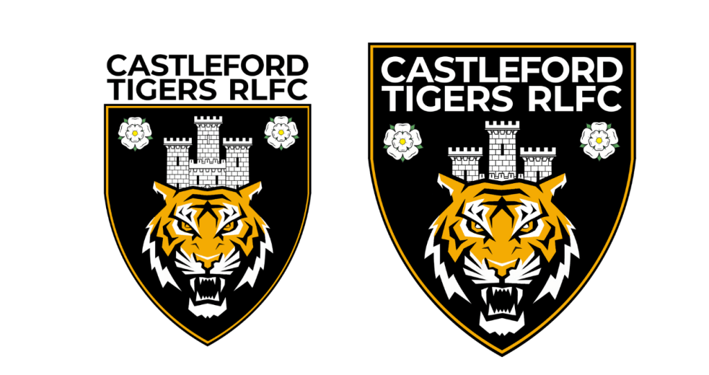
I much preferred the one on the right, even though it left me with less space to put the year of foundation, something I didn’t even include in the design in the end. But I think that’s okay. We’re looking to the future.
I made a few adjustments, including simplifying the Yorkshire rose so that the badge had fewer colours to stitch for embroidery, and thickening the border, and then it was done. I know it isn’t perfect, it’s far from perfect – but for a couple of day’s work, I’m happy. For the first time in my life (and I’ve tried many, many times over the years), I’ve created a badge for my team that I’d be happy to see us use.
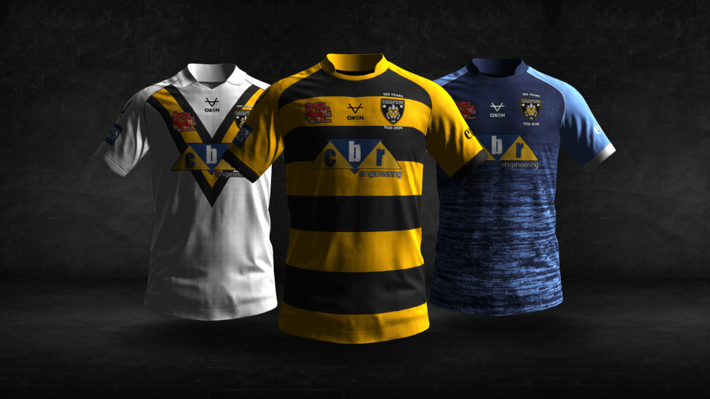
Step three: the shirts
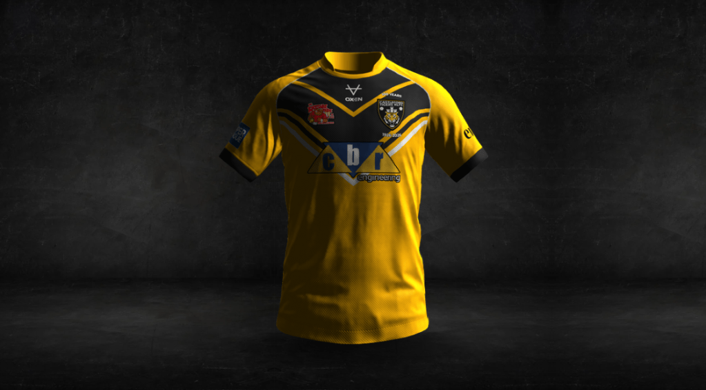
I spent a long time deciding on what to do with the home shirt, but for me, there was only ever one option for an away shirt.
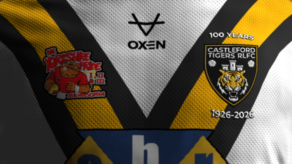
It’s iconic, and although it has been done a fair few times already, I decided that the shirt worn for 1970 Challenge Cup glory should be reimagined for the 100-year anniversary.
The way I got ‘1926’ in was to add some detailing around the badge, I went for a classic-style collar, but other than that, it speaks for itself really. It’s simple, but it’s 100% Cas.
I was actually tempted to make it the team’s primary shirt for 2026, but I’ve spoken at length about the need to pin down the amber as the club’s main colour, so I didn’t.
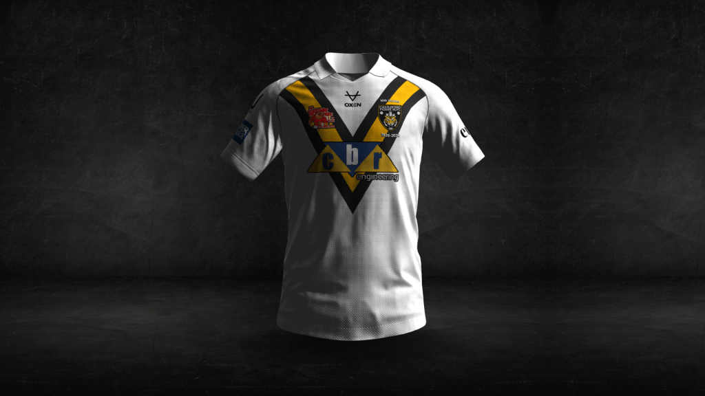
Therefore, next came the home shirt, which was harder to pin down. First, I went for a shirt inspired by the 1986 Challenge Cup victory (you know the one), but that was done in 2023. Too soon, and it has been reimagined a lot over the years.
That left me trying to create a completely new design, with different chevrons, pinstripes and stripes all used and discarded in a number of attempts, but this didn’t leave me feeling particularly inspired. Nothing felt right for such a historic year in the club’s history.
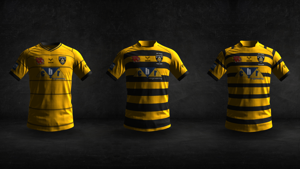
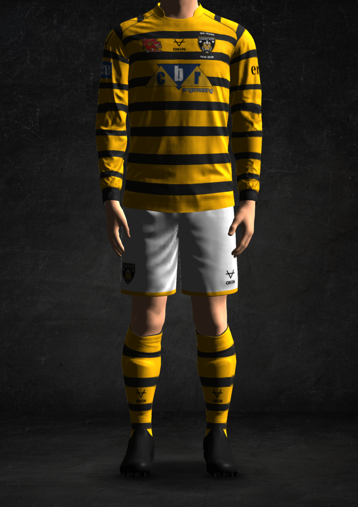
History was the road I went down for the home shirt in the end, but not trying to replicate a particular design. We could replicate old shirts forever, and it would just be an endless cycle of the same designs, ultimately.
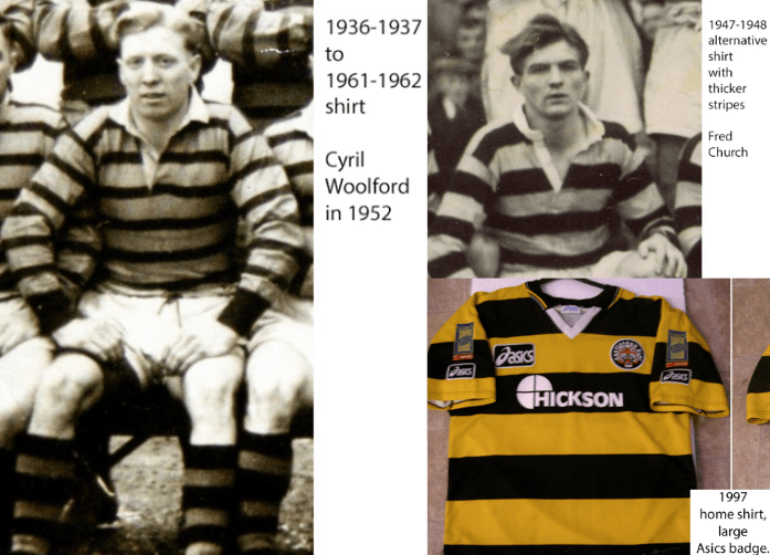
Instead, I used a simple horizontally-striped design, which was used through the 30s, 40s, 50s and 60s, before being abandoned. It also hasn’t been done , really, since then, apart from in 1997, meaning this isn’t in danger of being done to death.
This design doesn’t see the stripes continue on the sleeves, and the collar is amber, and these two things bring something new to the horizontal stripes design. I know, I know, it’s nothing exciting, but for me, it was important to include these as they make sure that amber is still the dominant colour of the shirt – and the TV cameras, from a high angle, would particularly see the effects of this choice.
Time for a third shirt.
I wanted this to be completely different to anything we’ve had before, so I experimented with a fair few colours and designs. I know some people love the outlandish green and purple of 2024 and the black and pink of 2025, so I thought, with two fairly run-of-the-mill shirts as the home and away, it would be good to cater for a different demographic.
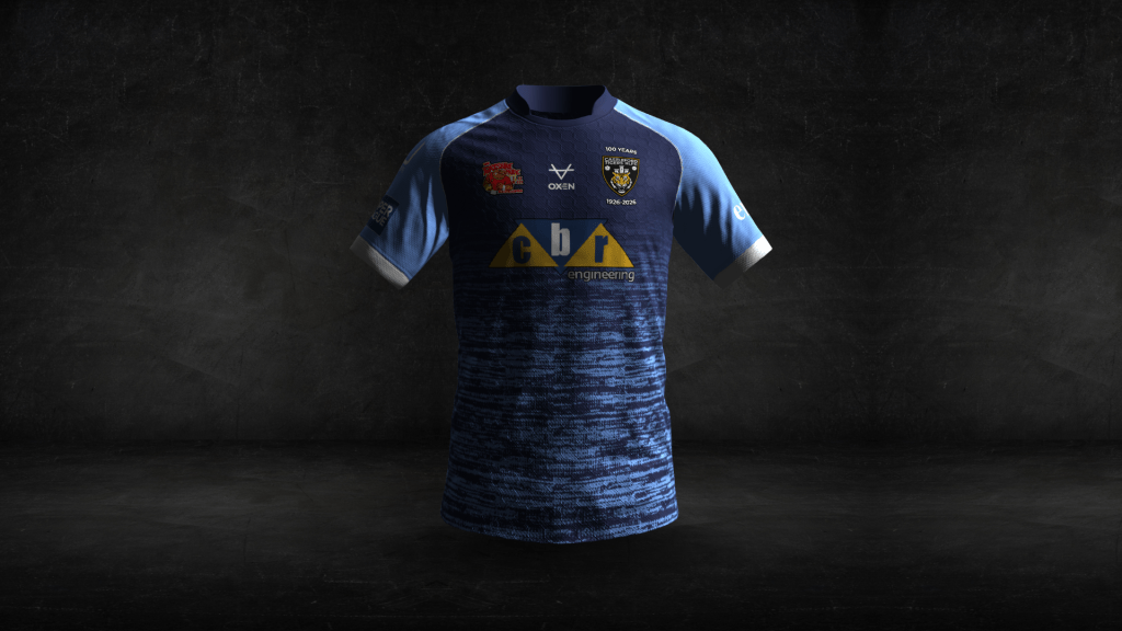
With the home mostly amber and the away mostly white, however, it made sense for the third shirt to be a darker colour, so I ended up going for a 1999 away-esque colour palette of dark blue, sky blue and white. Castleford Pottery typically used blue ‘overglaze’ (I hope this is the right term), so I saw this as an opportunity to finally include octagons in my work! Look closely, and you’ll see them.
And there you go. Three shirts that I think would go down well for a 100-year commemoration.
Footnote: what I didn’t go for
There’s plenty of stuff I chose not to go for in the end. Some of it made me embarrassed to have even done it. Some isn’t that bad.
Circular badges
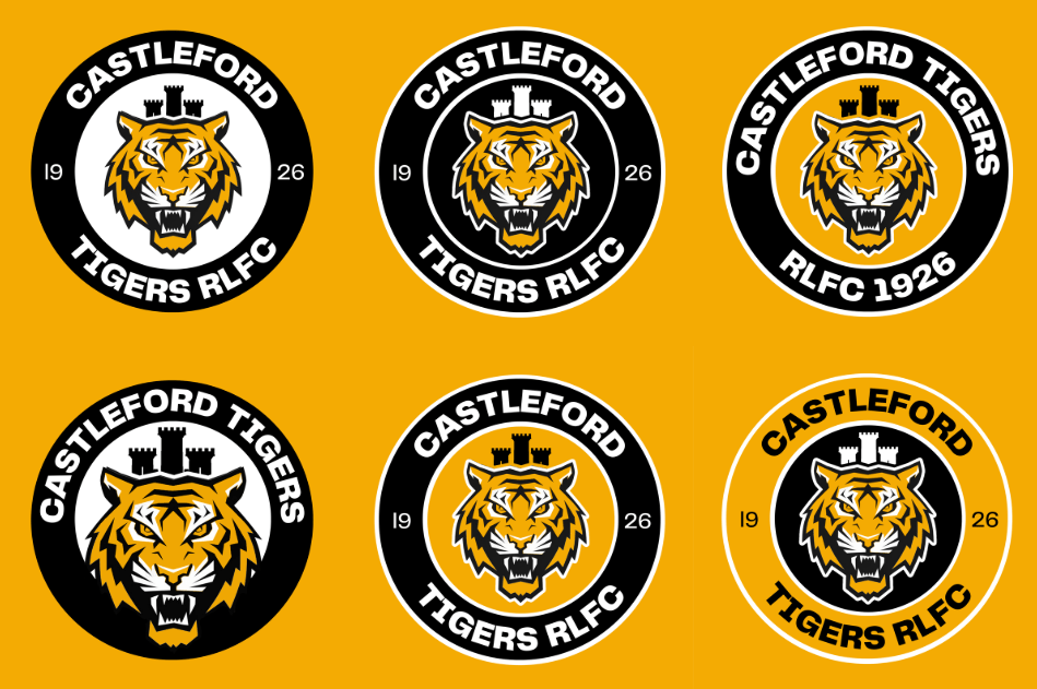
I don’t mind some of these designs, to be fair. As I’m sure you can tell, I was very indecisive over whether to include ‘RLFC’ and whether to include ‘1926’. And what colours to go for. The inspiration of the 1991 badge is clear to see in some, and an attempt to finally include amber as a major part of the design, too.
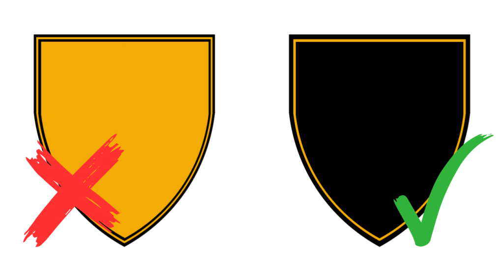
The amber shield
Again, I don’t hate this. However, I don’t really like it, and it gets completely lost on an amber shirt.
Thin stripes
I mentioned the 1986 design earlier, and I dismissed it along with some slightly different versions of the design I went for. I really love the 86 one, but we can’t really have the shirt reimagined when it was just done for 2023.
The shirt on the right was made using suggestions from Paul Hampton – thinner stripes, but more distance between them, and including some stripes on the sleeves, being more faithful to the shirt from the early years. It’s therefore more amber and less black, overall.
As a nod to that original kit, this could be paired with white shorts and socks with the same amber and black stripes as the shirt. The white shorts would be the standout, and a great idea for an anniversary kit, I think!
Plenty of colour schemes and designs
For a third shirt, there is so much you can do, and here are some designs I’ve done across the past few months! If you follow me on Twitter, you might recognise some of them.
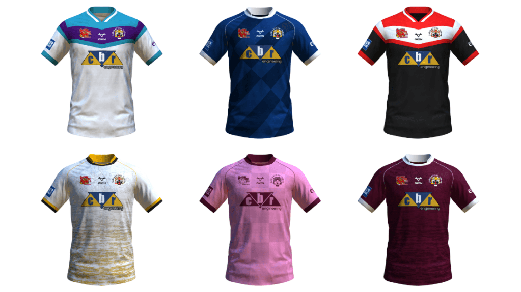
The bottom left and right shirts actually include a map of the town if you look closely enough, which I certainly considered doing for the 100-year project, but thought it would be better for a different year, ultimately.
Black and amber
The third shirt could easily have been a black and amber one. I strongly considered using a couple of these, but decided that it would be better to have a slightly different third shirt instead, since the home and away were simple, classic designs.
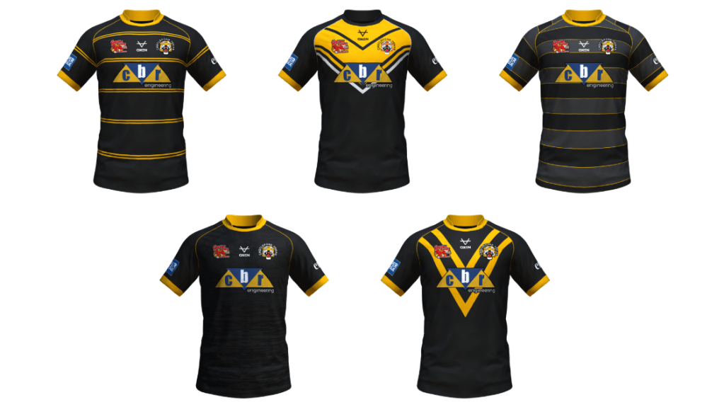
I really like some of these though.
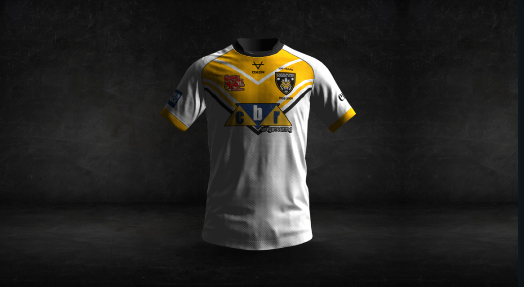
Early 90s-inspired design
I’m so annoyed that this doesn’t look as good as I imagined! I still like it though, and it could certainly be an interesting option for a design in the near future, I think.
It’s still great in white, though, and to be honest, this is the design that makes the badge look the nicest, in my opinion.


Leave a comment